Dish Pit

End-to-end restaurant recipe app concept
UX Designer
Food & Beverage
Context
On his day off, my partner was spending his time writing out recipes on Google Docs because his restaurant had hundreds of recipes in different binders, loose leaf pages, and notecards strewn across the office. I remembered that when I worked in a cafe in college, our recipes were written on sticky notes taped to the wall in front of the cutting board. In restaurants across the world, recipe documentation runs the gamut from stained notecards to expansive online files made by chefs who sometimes forget to convert measurements from imperial to metric. Typing out his 4th vinaigrette recipe of the day, and struggling to keep the document format perfect, he looked across the table and said, “Why don’t you make an app for this?” And so I made Dish Pit.
Problem:
Recipe documentation is traditionally time consuming, disorganized, and unstandardized across different restaurants. Chefs struggle with getting cooks to make food consistently, and cooks struggle with finding a consistent recipe
Goal:
Create an app that allows food and beverage professionals to easily document, organize, and communicate their recipes.
Research
Initial research for Dish Pit consisted of a two-pronged effort: a competitive analysis and user interviews.
Competitive Analysis
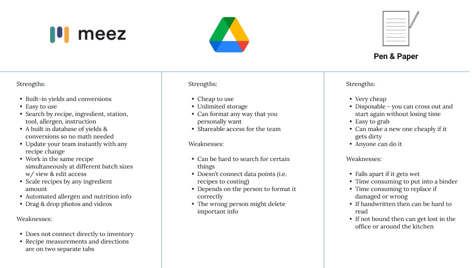
In my research, I found surprisingly few competitors in this space. There are a plethora of recipe apps that a suited for home cooking, but do not provide the scope needed for a restaurant to function. In the tech space, one competitor existed: Meez. While looking at Meez’s offerings gave me an idea of what might be a jumping-off point for my MVP, I also had a lot to learn from the more-frequently used competitors: Google Drive, and good old pen and paper.
User Interviews
For User Interviews I was able to recruit 4 participants: 3 kitchen managers, and 1 line cook. Given my project’s tight time constraints and the busy nature of kitchens, participants were difficult to wrangle, but thankfully even with these constraints some strong patterns emerged. I used two separate scripts for kitchen managers and line cooks.

The interviews revealed that all restaurants seem to have different forms of recipe documentation and standards of communication. Cooks spoke of taking personal liberties with dishes if there is not easy access to a recipe, or if it will take too long to do the math to scale a recipe up or down. Recipe documentation tended to land on the shoulders of the head chef or a sous chef, and with labor shortages (plus all the regular responsibilities of the kitchen), documentation was consistently on the chopping block of the to-do list. Across the board, clear communication was the key ingredient to success in the kitchen. While some felt that they had hit the mark using their current methods, others were excited by the prospect of a live-updating document that anyone with a phone or computer could access.
Key takeaways were as follows:
A clear table format is preferable
Recipes need space for notes and special accommodations that aren’t listed in methodology
Communication is important: comments and notifications are a must
Recipe development can be as scattered as recipe documentation. Having both in the same space would be helpful.
Being able to scale a recipe and change units from imperial to metric would save time and frustration in the kitchen
Definition
User Personas
In order to distill the information I had gathered during the research stage, and to create a touchstone to come back to throughout the designing process, I created Personas for the Chef and the Line Cook. While the app was initially ideated as a problem solve for the chef in my life, equally iportant is the communication with the Line Cook who executes the dishes


Card Sort
This card sort included 3 participants. The results were varied, which is to be expected from a small research pool. The basic information pulled from this exercise is that back of house professionals categorize based on their personal priorities and that a menu can be parsed apart in several ways and those parts intersect in several ways.
Participant 1
Participant 1 separated terms into 11 different categories. These included website navigation, Recipe Bible, dish descriptors, dish execution, units, print, prep, ordering, R&D, P&L, and management. The participant had in depth explanations for each category and why the terms belonged in them. This helped me to see how deeply everything could be broken down and how the parts function as gears to create a whole plan.
Participant 2
Participant 2 had a more scattered board at the end of the exercise. There were 7 categories in total: recipe management, accounting, built in cost, account, dish components, food cost, and a random pile. While we had our end-of-session wrap up discussion, the participant continued to move sticky notes from column to column. In chatting about this behavior, we concluded together that many terms functioned within many categories and that the functions of a recipe app could ebb and flow similarly so that people could access points of information from several different pages.
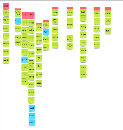
Participant 3
Participant 3 was very organized with their categorization and ended with 7 categories: measurements, ordering, R&D, onboarding, on-shift, administrative, and guest-facing information. These results gave me more insight into how someone might expect to see the sitemap laid out. The participant also mentioned that they were currently working within Google Docs and had trouble not being able to search terms across all of her documents. This melds with Participant 2’s results–things need to be laid out clearly but also intersect and cross-reference easily.
Product Roadmap
I took the information gathered in the research and definition phase and created a product roadmap to ensure a realistic MVP, and guide posts for the future.

Sitemap

Design
The design process consisted of many iterations of wireframes and low fidelity mockups before a sensible product started to emerge. I also experimented with several different color palettes before choosing tones of black, white, and blue to reflect a clean and organized kitchen.
Wireframes


Low Fidelity Mockup

High Fidelity Prototype

Testing
Six participants who are back-of-house professionals took a moderated user test of the high fidelity prototype. Tests were conducted mainly in person and often during work breaks, or just after work when participants were in the mind-frame for work and how this app would have impacted their day. Below are the tasks involved in the test, as well as the affinity map and key takeaway.
TASK 1: Can you please create an account, find the summer dinner menu, and view the recipe for potato gnocchi?
- On a scale of 1-5 (1 being easy and 5 being difficult) how would you rate task 1?
TASK 2: You have an idea for the summer menu that you’ve been starting to think about. Where would you record that?
- On a scale of 1-5 (1 being easy and 5 being difficult) how would you rate task 2?

Reading the Affinity Map:
Users easily completed task 1
Users easily completed task 2
Users enjoyed the clean, organized feeling of the site
Points of confusion include: What the “Recipe Center” is, allergy icons, and how to add elements to the R&D notebook
Chefs interviewed were very eager to give input on what should be in the product roadmap. Ideas are listed in the affinity map “should haves” section
Key Takeaways:
All users were easily able to complete the two tasks given to them
Users were happy with the clean look and feel of the UI
Home page needs to greet the specific restaurant and keep in mind restaurant groups
Need to decide what will be included in the eventual mobile version, and the next round of MVPs
Iterations

After testing, I edited the product roadmap to reflect the new priorities that had emerged, and went to work on the P1 changes.

Conclusions
This process illuminated a stark need in the restaurant industry as the world continues to become more digital and standards of communication reflect those changes.
While some old school chefs bemoaned the loss of the time of personal notebooks, they also showed excitement for the product and were very vocal about ideas for the product moving forward.
Most pressing was the need for a mobile version of the app to communicate with staff who do not keep computers at home due to the nature of their profession. With that in mind, I created a product roadmap for the mobile suite that would be a paired down, but functional, version of the desktop app. You can see those recommendations below.
Additionally, I would recommend further testing, and building out of the P2-P4 elements for the desktop application.
Updated Dish Pit Product Roadmap

Dish Pit Mobile Product Roadmap
🍜